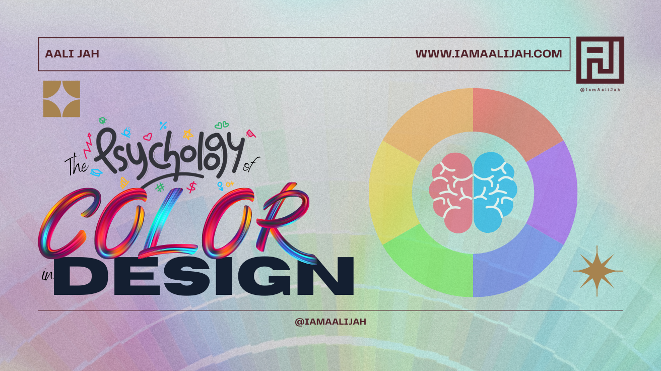
The Psychology of Color in Design

The Psychology of Color in Design
Colors are not just visual elements; they play a crucial role in the design world by influencing emotions, perceptions, and behaviors. Understanding the psychology of color can elevate your design projects, creating a stronger emotional connection with your audience. In this blog post, we’ll explore how different colors affect design and how to use them effectively to convey your message.
The Impact of Color on Design:
- Red: Energy and Passion
Red is a powerful color that evokes strong emotions such as passion, excitement, and urgency. It’s often used to grab attention and stimulate action. In design, red can be effective for calls-to-action and highlighting important elements. - Blue: Trust and Calm
Blue is associated with trust, reliability, and calmness. It’s commonly used in corporate designs and websites to build credibility and provide a sense of tranquility. Blue tones are ideal for professional and serene environments. - Green: Growth and Harmony
Green symbolizes nature, growth, and balance. It’s perfect for designs related to health, wellness, and environmental topics. Green can also create a sense of relaxation and renewal. - Yellow: Optimism and Energy
Yellow represents positivity, creativity, and energy. It’s a bright, attention-grabbing color that can be used to evoke feelings of happiness and optimism. However, it should be used sparingly to avoid overwhelming the viewer. - Purple: Luxury and Creativity
Purple combines the stability of blue and the energy of red, making it a color associated with luxury, creativity, and wisdom. It’s often used in designs aiming to convey elegance and sophistication. - Orange: Enthusiasm and Innovation
Orange is a vibrant color that symbolizes enthusiasm, creativity, and warmth. It’s great for designs that aim to inspire and energize the audience, often used in marketing and creative fields. - Black: Elegance and Authority
Black denotes sophistication, authority, and elegance. It’s a versatile color used in high-end designs and to create a sense of depth. Black can be paired with other colors to enhance contrast and readability. - White: Simplicity and Purity
White signifies purity, simplicity, and cleanliness. It’s commonly used in minimalist designs to create space and highlight other colors. White backgrounds can help to make content more readable and accessible.
Incorporating color psychology into your design strategy can significantly impact how your audience perceives and interacts with your brand. By understanding the emotional and psychological effects of different colors, you can make more informed design choices that enhance your message and connect with your audience on a deeper level.
Tags: Aali Jah, Aali Jahm, art and design, brand design, branding, color choice, color impact, color in design, color psychology, color theory, color trends, content creation, creative design, creative ideas, creative process, design advice, design community, design concepts, design elements, design expert, design guide, design inspiration, design strategy, design theory, design tips, designers life, digital design, graphic art, graphic design, IamAaliJah, marketing design, user experience, visual appeal, visual design, visual marketing, web design


